In this collaborative UI/UX project, I worked with a team of five to design a responsive web page based on two key user scenarios. My role spanned research, ideation, and wireframing, and later focused on translating our style guide into polished, high-fidelity UI designs.
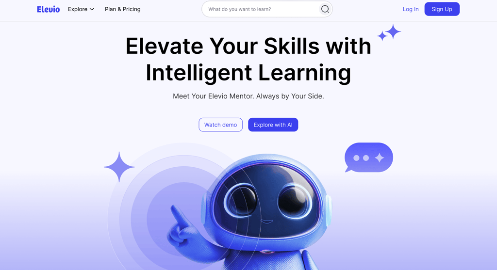
Challenge: Design a web platform that enables users to discover, engage with, and complete educational content while supporting seamless navigation and a consistent, intuitive experience across devices.
Solution: We developed a fully responsive web interface with features that allow users to browse courses, track progress, and interact with content efficiently. The design prioritizes clarity, ease of use, and a cohesive visual language to enhance the learning experience.
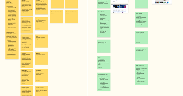
Research: To inform our design, we studied similar platforms, analyzed user flows, and explored UI patterns to understand how people navigate educational content. These insights guided our layout, interaction design, and visual decisions to create a user-friendly and engaging platform.
Weeks 1–2 were focused on UX research and discovery. During this phase, we conducted benchmarking, analyzed competitors, gathered ideas, and reviewed the given scenarios to better understand user needs. These insights helped inform our early wireframe sketches and laid a strong foundation for the design direction moving forward.
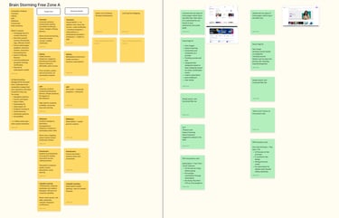
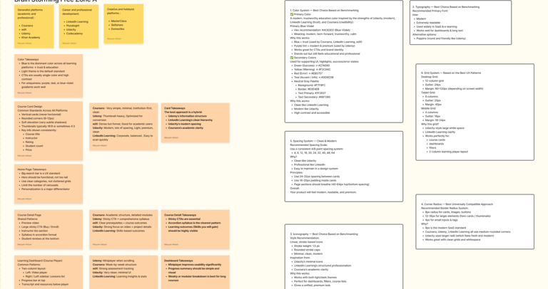
Research and discovery
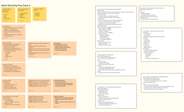
In the following weeks, we shifted our focus to visual exploration. We analyzed competitor flows, collected UI screenshots and visual references, and used these insights to build a cohesive style guide that guided the rest of the design process.
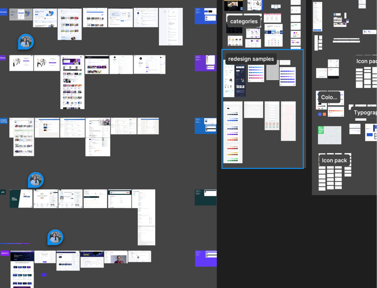
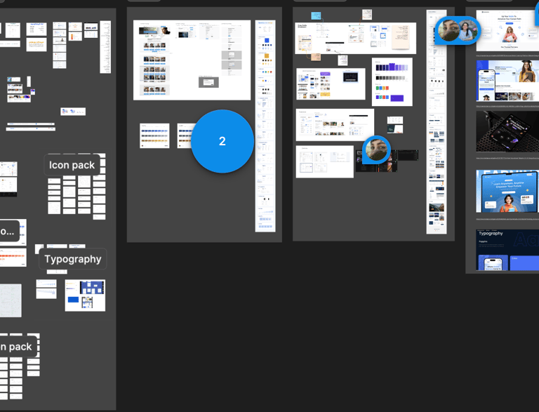
Benchmarking
This phase involved multiple rounds of discussion and iteration around visual decisions, including color selection, typography, iconography, and supporting UI elements. After nearly a week of refining, redesigning, and aligning as a team, we finalized a style guide that established a clear and consistent visual language for the website.
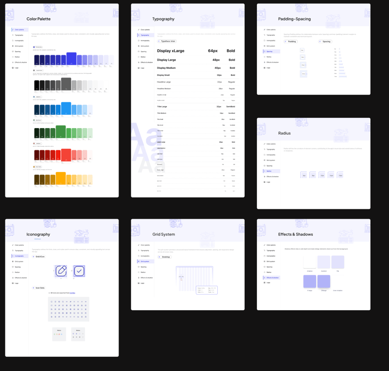
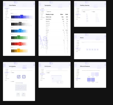
Style Guide
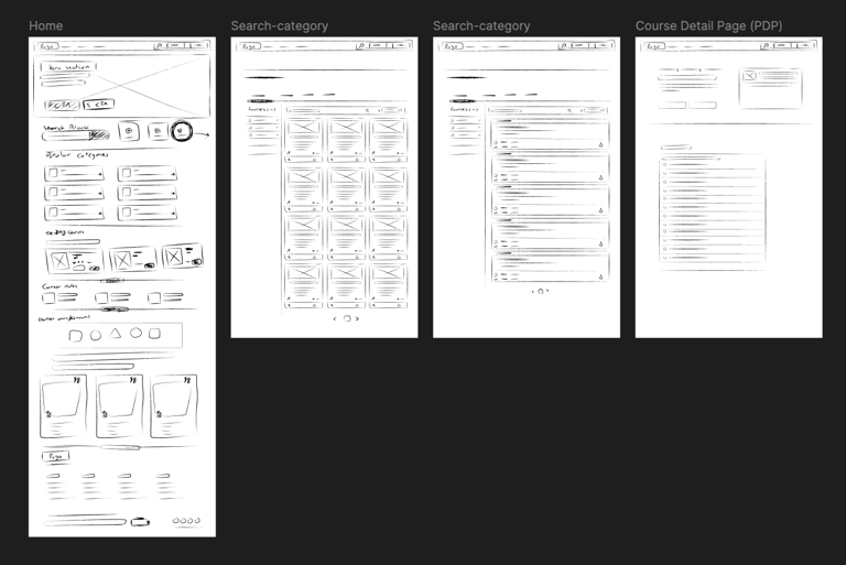
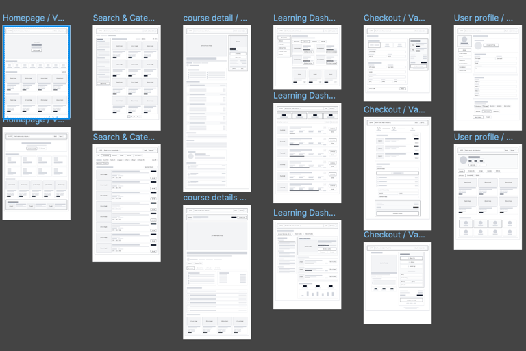
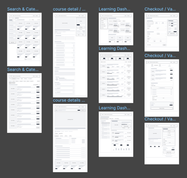
Wireframing & Layouts
after finalizing the style guide, we moved into designing low-, mid-, and high-fidelity wireframes for the main pages. This process allowed us to visualize the structure, plan the placement of elements, and understand how users would interact with different features before moving into full UI design.
Lo Fidelity Wireframe
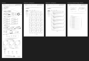
Mid Fidelity Wireframe
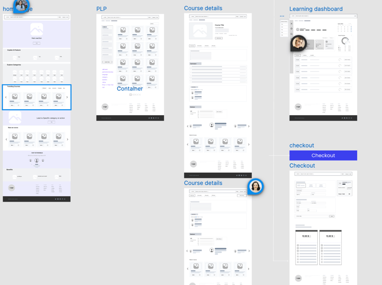
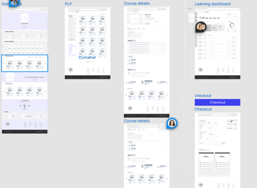
Mid Fidelity Version 2
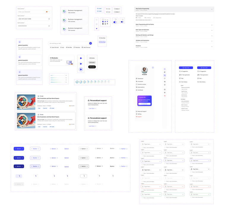
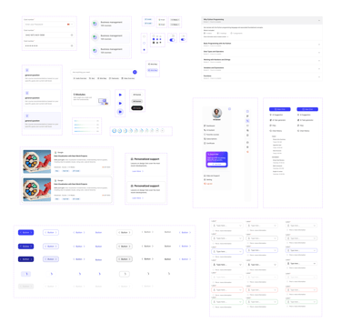
Components