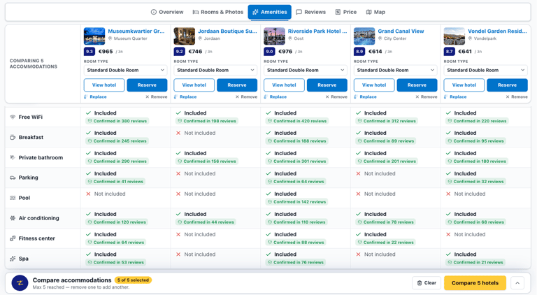
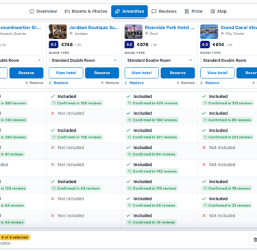
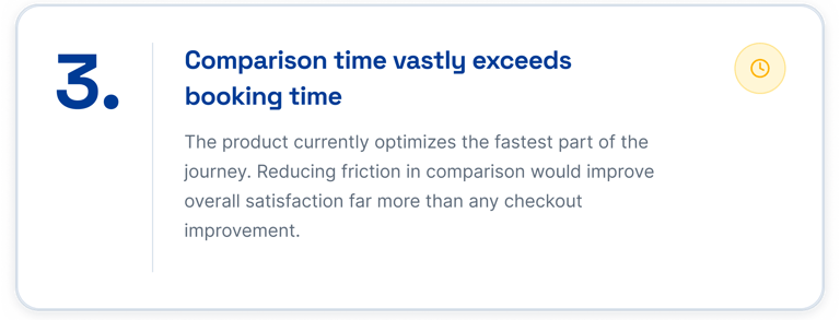
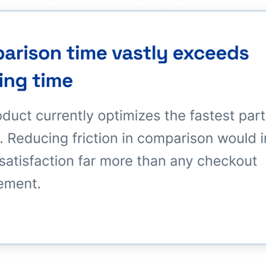
Comparing amenities across multiple hotels requires switching between tabs, which is time-consuming.
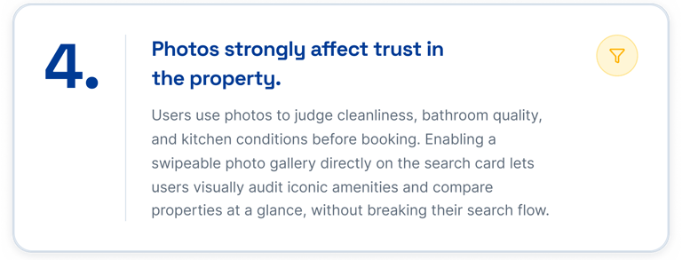
A side-by-side amenity comparison tool could help users
choose faster and feel more confident in their booking decisions.
Reducing Comparison Decision Time on Booking.com Through Side-by-Side Hotel Comparison
We are two designers, Elnaz Mirshah and Mahtab Hagholzakerin, guided by mentor Marzie Nadali through a private mentorship program.
Why Booking.com?
470 million people visit Booking.com every month. We spent six weeks finding where the experience quietly breaks.
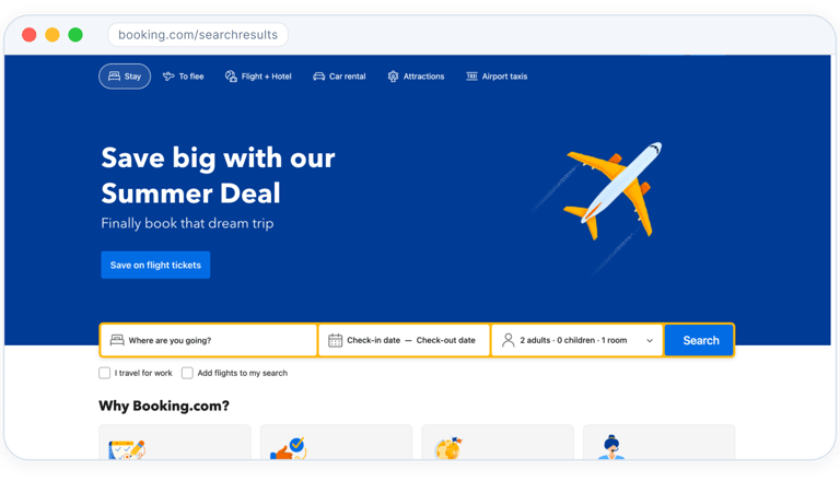
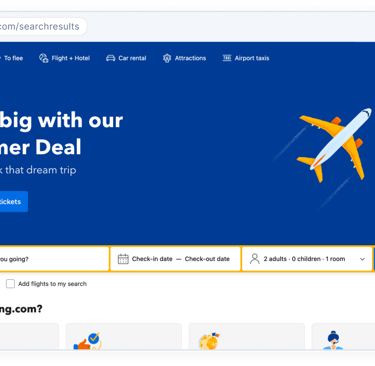
Booking.com is one of the world's most-visited travel platforms, headquartered right here in the Netherlands. It connects millions of travelers with hotels, apartments, and unique stays, as well as flights, car rentals, and attractions, available in multiple countries and languages worldwide.
Why Booking.com?
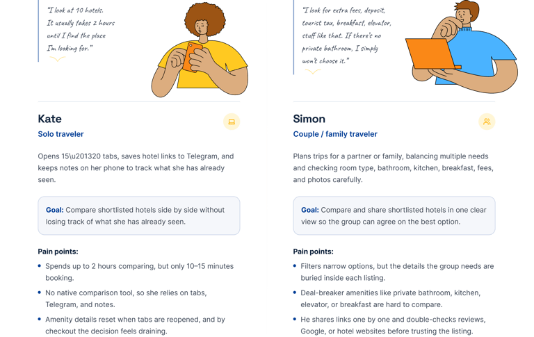
Two travelers, two completely different checklists, and both ended up doing the same thing: opening a pile of tabs.
Yet despite these innovations, one critical step in the booking journey remains unsupported,
Identifying the Gap
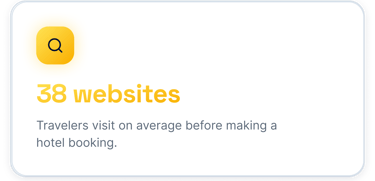
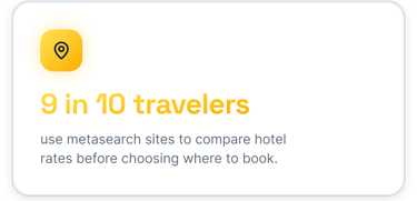
Travelers visit 38 sites before booking one hotel. We wanted to know why a single platform was not enough.
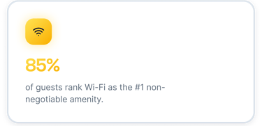
Comparing hotels on Booking.com means opening each property in a separate tab, forcing users to rely on . memory across multiple pages. With no native side-by-side . comparison tool, the decision moment becomes a source of cognitive overload, too much information, scattered across too many places. This friction at the final stage of the booking journey leads to decision fatigue and drop-off. A structured comparison feature could help users choose faster and with greater confidence.

Identifying the Gap
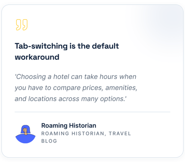
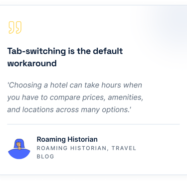
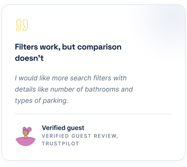
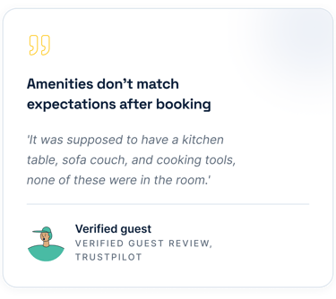
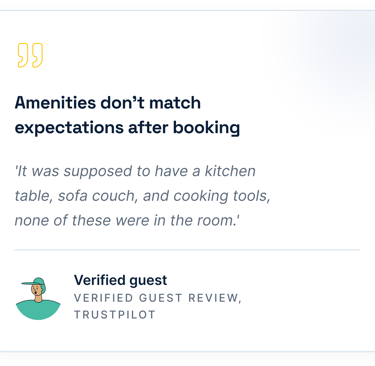
Voices from real travelers
Research Synthesis
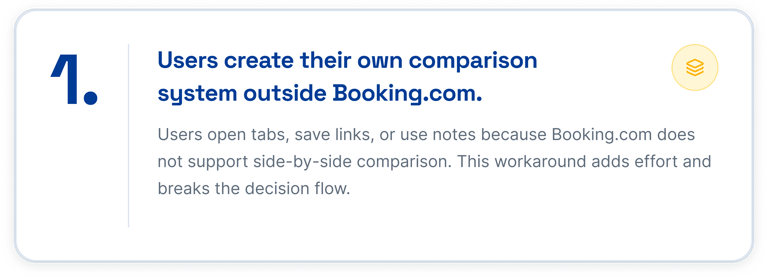
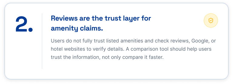
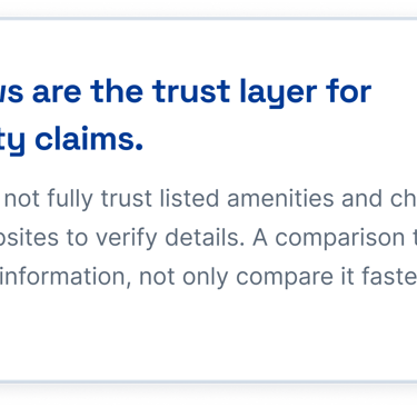
Every traveler we spoke to rebuilt the same missing feature by hand, with tabs, notes, and instant messaging apps links.

Limitation
We Could Validate the Experience, Not Its Real-World Impact
Our findings were based on a relatively small, non-random participant sample, so they should be treated as directional rather than representative of Booking.com’s full user base. We also relied mainly on interviews and prototype testing without access to internal behavioral data such as comparison time, drop-off, or booking conversion.
Because the concept was tested in a controlled environment rather than a live booking context, users did not face real prices, financial risk, or time pressure. Further research would be needed to validate the experience across mobile devices, accessibility needs, different markets, and real collaborative decision-making between travel companions
Competitor analysis
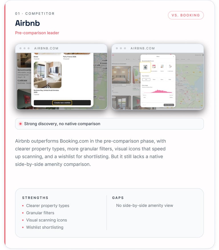
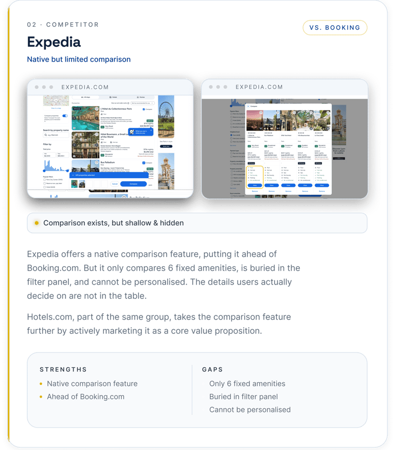
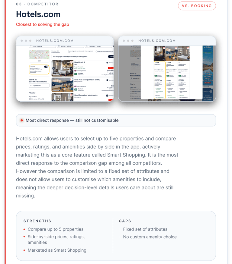
We checked four competitors. The one closest to solving it still locks you into six fixed amenities.
We analysed four competitors to understand how the industry approaches hotel comparison. The pattern was consistent: some have taken steps toward solving it, but every attempt stops short of what users actually need.
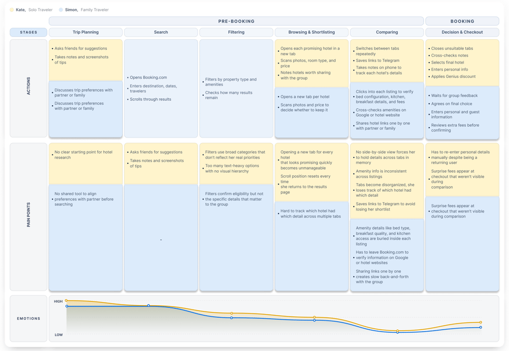
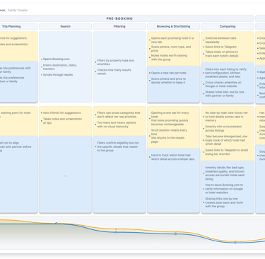
User Journey Map
Both personas start calm and end drained. The journey breaks at the exact same step: comparing.
Prioritization
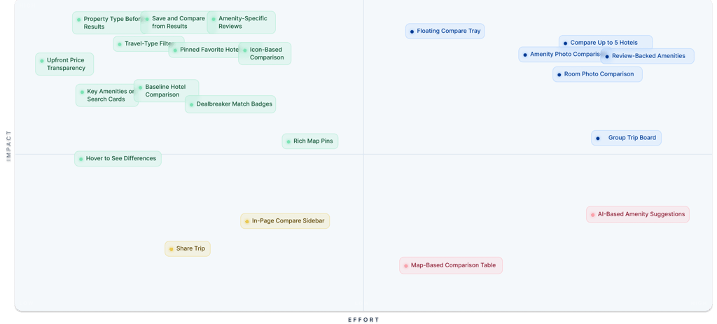
The Matrix Turned 22 Ideas Into One Design Direction
High Fidelity Design
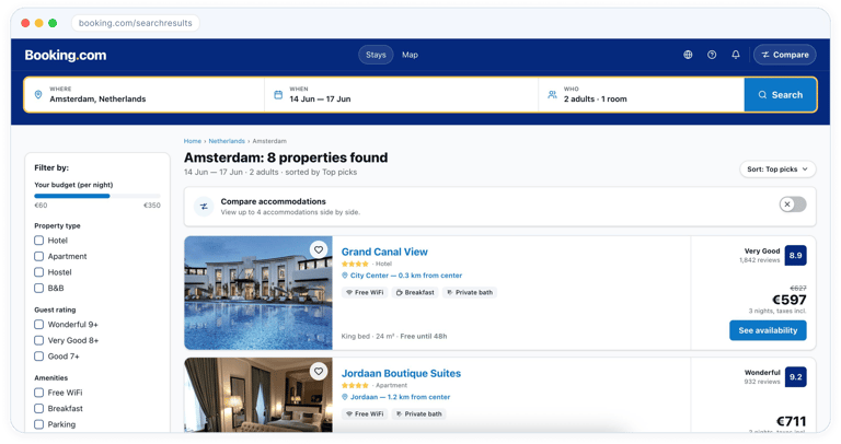
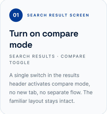
Seven screens, zero new tabs. Compare mode lives inside the Booking.com people already know.